A configuração do produto ocorre através do Wizard de configuração, nele ocorre o processo de manutenção de temas de layout, temas de widgtes, recurso de navegadores, padronização do ambiente e copiar páginas. As alterações dos parâmetros é vista no preview, assim permitindo o entendimento a cada personalização.
Observação:
-
Somente usuários com papel de administrador ou usuários com permissão podem acessar e editar a página de configuração. As widgets contidas na página não podem ser removidas, caso forem o uso do produto será comprometido.
-
Para ativar o tema clássico do Fluig em versões da plataforma 1.8.0, ou superior, é necessário acessar o Painel de Controle > Coluna de Personalização > Temas > No canto superior direito escolher a aba de Temas antigos e selecionar a opção ON para o tema clássico.
O que é um Tema de Layout?
Tema de layout controla as cores do topo, menus de páginas e customização dos widgets padrões (Busca, Alerta e Perfil).
Os temas estão agrupados por categorias: Manufatura, Varejo e Serviços. Nossos profissionais de comunicação avaliaram cada segmento e identificaram características, as quais deram origem a temas padrões.
O usuário pode alterar os temas padrões, ou criar temas novos, através do botão "Copiar". Sugerimos fazer a cópia do tema padrão que está mais alinhado com a sua identidade visual.

Através do wizard de configuração é possível migrar todas as páginas do TOTVS Fluig Plataforma (customizadas e padrões) para um tema de layout do Digital Workplace by Digte.
Onde é utilizado o tema de layout?
O tema de layout pode ser utilizado em qualquer página com o layout da Digte.
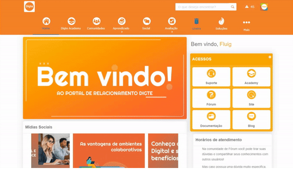
Para identificar o layout da Digte basta olhar as bordas coloridas envolta do elemento, como no exemplo abaixo:

É possível escolher o layout ao criar uma nova página, criar uma comunidade ou ao trocar o layout de uma página já existente. Por exemplo: Ao escolher a opção "Trocar Layout", você verá diversas opções de layout de página, basta selecionar a opção que deseja e clicar em "Aplicar layout".

Os temas de layout são utilizados na edição das páginas, sendo que páginas diferentes podem ter temas de layout diferentes. Por exemplo: A página "Home" tem um tema de layout diferente da página "Sobre a empresa"

Configurando tema de layout
Dentro de um tema o usuário poderá alterar diversos recursos, como: topo, menu, página, widgets, slots, rodapé. Enquanto o usuário edita é possível visualizar no preview ao lado como as modificações irão ficar.

Identificação do tema:
-
Código: Código de identificação do tema. Não deve ser preenchido com espaços, com caracteres especiais e letras maiúsculas, digite somente letras minúsculas
-
Nome: Insira o nome do tema criado
Topo e menu:
Topo:
-
Altura: Defina uma altura para o seu topo
-
Comportamento:
-
Fixo: O topo fica fixo no inicio da página
-
Acompanhar rolagem: O topo acompanha a rolagem da tela
-
-
Posição do logo: Defina se o logo será a esquerda, direita ou centralizado
-
Exibir logo:
-
Sim: O logo aparecerá no topo
-
Não: O logo não aparecerá no topo
-
-
Cor de fundo: Escolha qual será a cor de fundo do seu topo
-
Imagem de fundo: Caso opte por colocar uma imagem de fundo no topo, primeiro insira a imagem no seu ECM e depois clique no campo busca para selecionar a imagem desejada. OBS: Se colocar uma imagem ela irá sobrepor a cor de fundo
-
Repetir imagem: Defina se a imagem de fundo irá se repetir no topo
Menu Horizontal e Vertical:
-
Habilitar: Defina se o menu será habilitado
-
Sim: Habilita a exibição do menu
-
Não: Desabilita a exibição do menu
-
-
Versão:
-
1: Habilita o submenu em cascata ao passar o mouse em cima de páginas que possuam submenu.
-
2: Desabilita a exibição do submenu em cascata e habilita uma funcionalidade que permite clicar em cima do botão da página no menu e substituir todo o menu pelos itens que estariam dentro do submenu em cascata.
-
-
Posicionamento: Defina se o posicionamento do menu
-
Esquerda: O menu ficará na esquerda da página
-
Topo: O menu ficará no topo da página
-
-
Altura: Defina a altura do menu em pixels (px). Caso não será preenchido, o valor padrão será 60 pixels (px)
-
Cor de fundo: Defina a cor de fundo do menu
-
RGBA: Colocar o código em RGBA
-
Hexadecimal: Colocar o código em hexa. Este código será convertido em RGBA
-
-
Cor de fundo (cursor sobreposto): Defina a cor de fundo ao passar o mouse por cima
-
RGBA: Colocar o código em RGBA
-
Hexadecimal: Colocar o código em hexa. Este código será convertido em RGBA
-
-
Cor do marcador: Defina a cor da linha que fica abaixo do botão da página ativa
-
RGBA: Colocar o código em RGBA
-
Hexadecimal: Colocar o código em hexa. Este código será convertido em RGBA
-
-
Imagem de fundo: Caso opte por colocar uma imagem de fundo no menu, primeiro insira a imagem no seu ECM e depois clique no campo busca para selecionar a imagem desejada. OBS. Se colocar uma imagem ela irá sobrepor a cor de fundo
-
Repetir imagem: Defina se a imagem de fundo irá se repetir no menu
-
Não repetir: A imagem não irá se repetir
-
A direita da Widget : As imagens se repetirão somente a direita das widgets do topo
-
A baixo da Widget: As imagens se repetirão somente a baixo das widgets do topo
-
Ambas as direções: As imagens se repetirão a baixo e a direita das widgets do topo
-
-
Formatação do texto: Defina a formatação que os textos devem ter no menu
-
Capitalizar: A primeira letra de cada palavra será maiúscula
-
Minúsculas: Todas as letras serão maiúsculas
-
Maiúsculas: Todas as letras serão minúsculas
-
-
Cor do título: Defina a cor do título do menu
-
RGBA: Colocar o código em RGBA
-
Hexadecimal: Colocar o código em hexa. Este código será convertido em RGBA
-
-
Cor do título (cursor sobreposto): Defina a cor do título ao passar o mouse por cima
-
RGBA: Colocar o código em RGBA
-
Hexadecimal: Colocar o código em hexa. Este código será convertido em RGBA
-
-
Tamanho do título: Defina o tamanho dos títulos em pixels (px)
-
Tamanho do título no submenu (versão 1): Defina o tamanho dos títulos, na versão 1 do menu, em pixels (px) - Somente no menu Horizontal
-
Alinhamento do título no submenu (versão 1): Defina o alinhamento dos títulos - Somente no menu Horizontal
-
Esquerda: Os títulos ficarão a esquerda
-
Centralizado: Os títulos ficarão centralizados
-
Direita: Os títulos ficarão a esquerda
-
-
Tipo de abertura de submenu (versão 1): Defina qual será a abertura do submenu - Somente no menu Vertical
-
Accordion: O submenu será aberto para baixo
-
Abertura lateral : O submenu será aberto na lateral direita
-
-
Cor do ícone: Defina qual será a cor do ícone no menu. OBS: A cor escolhida só será aplicada em ícones padrões do TOTVS Fluig Plataforma
-
RGBA: Colocar o código em RGBA
-
Hexadecimal: Colocar o código em hexa. Este código será convertido em RGBA
-
-
Tamanho do ícone: Defina o tamanho em pixels (px) dos ícones
-
Cor do ícone (cursor sobreposto): Defina a cor do título ao passar o mouse por cima. OBS. A sobreposição da cor só será aplicada em ícones padrões do TOTVS Fluig Plataforma
Página:
-
Cor de fundo: Defina a cor de fundo da página
-
RGBA: Colocar o código em RGBA
-
Hexadecimal: Colocar o código em hexa. Este código será convertido em RGBA
-
-
Centralizar conteúdo: Defina se o conteúdo da página deve ficar centralizado
-
Sim: Conteúdo ficam no meio da página
-
Não: Os conteúdo preenchem toda a largura da página
-
-
Largura do conteúdo centralizado: Defina em pixels (px) qual a largura que os conteúdos centralizados devem ter
-
Imagem de fundo: Caso opte por colocar uma imagem de fundo no menu, primeiro insira a imagem no seu ECM e depois clique no campo busca para selecionar a imagem desejada. O tamanho recomendado é 1024 x 768 pixels (px) OBS. Se colocar uma imagem ela irá sobrepor a cor de fundo
Widgets:
Busca:
-
Customizar: Permite habilitar a customização do campo de busca
-
Sim: Habilita a customização
-
Não: Desabilita a customização
-
Esconder: Esconde o componente
-
-
Curvatura: Defina a curvatura do campo de 0 à 50
-
0 fica quadrado
-
50 fica em sua curvatura máxima, redondo
-
-
Cor de fundo: Defina a cor de fundo do componente
-
RGBA: Colocar o código em RGBA
-
Hexadecimal: Colocar o código em hexa. Este código será convertido em RGBA
-
-
Cor do ícone: Defina a cor do ícone (lupa)
-
RGBA: Colocar o código em RGBA
-
Hexadecimal: Colocar o código em hexa. Este código será convertido em RGBA
-
Alerta (Sem notificação):
-
Customizar: Permite habilitar a customização do campo de busca
-
Sim: Habilita a customização
-
Não: Desabilita a customização
-
-
Curvatura: Defina a curvatura do campo de 0 à 50
-
0 fica quadrado
-
50 fica em sua curvatura máxima, redondo
-
-
Cor de fundo: Defina a cor de fundo do componente
-
RGBA: Colocar o código em RGBA
-
Hexadecimal: Colocar o código em hexa. Este código será convertido em RGBA
-
-
Cor do ícone: Defina a cor do ícone
-
RGBA: Colocar o código em RGBA
-
Hexadecimal: Colocar o código em hexa. Este código será convertido em RGBA
-
Alerta (Com notificação):
-
Cor de fundo: Defina a cor de fundo do componente
-
RGBA: Colocar o código em RGBA
-
Hexadecimal: Colocar o código em hexa. Este código será convertido em RGBA
-
-
Cor do ícone: Defina a cor do ícone
-
RGBA: Colocar o código em RGBA
-
Hexadecimal: Colocar o código em hexa. Este código será convertido em RGBA
-
Messaging (Sem notificação):
-
Customizar: Permite habilitar a customização do campo de busca
-
Sim: Habilita a customização
-
Não: Desabilita a customização
-
-
Curvatura: Defina a curvatura do campo de 0 à 50
-
0 fica quadrado
-
50 fica em sua curvatura máxima, redondo
-
-
Cor de fundo: Defina a cor de fundo do componente
-
RGBA: Colocar o código em RGBA
-
Hexadecimal: Colocar o código em hexa. Este código será convertido em RGBA
-
-
Cor do ícone: Defina a cor do ícone
-
RGBA: Colocar o código em RGBA
-
Hexadecimal: Colocar o código em hexa. Este código será convertido em RGBA
-
Messaging (Com notificação):
-
Cor de fundo: Defina a cor de fundo do componente
-
RGBA: Colocar o código em RGBA
-
Hexadecimal: Colocar o código em hexa. Este código será convertido em RGBA
-
-
Cor do ícone: Defina a cor do ícone
-
RGBA: Colocar o código em RGBA
-
Hexadecimal: Colocar o código em hexa. Este código será convertido em RGBA
-
Perfil:
-
Customizar: Permite habilitar a customização do campo de busca
-
Sim: Habilita a customização
-
Não: Desabilita a customização
-
-
Curvatura: Defina a curvatura do campo de 0 à 50
-
0 fica quadrado
-
50 fica em sua curvatura máxima, redondo
-
Slots
-
Fonte: Escolha a fonte para ser aplicada em seus componentes. Só é possível inserir fontes do Google Fonts
-
Espaço entre os slots: Defina se haverá espaço entre os slots
-
Sim: Os slots terão espaço entre si
-
Não: Os slots não terão espaço entre si
-
-
Cor de fundo: Defina a cor de fundo dos slots
-
RGBA: Colocar o código em RGBA
-
Hexadecimal: Colocar o código em hexa. Este código será convertido em RGBA
-
-
Imagem de fundo: Caso opte por colocar uma imagem de fundo no menu, primeiro insira a imagem no seu ECM e depois clique no campo busca para selecionar a imagem desejada. O tamanho recomendado é 1024 x 768 pixels (px) OBS. Se colocar uma imagem ela irá sobrepor a cor de fundo
Rodapé
-
Habilitar: Defina se o rodapé padrão do TOTVS Fluig Plataforma deverá aparecer
-
Sim: Habilita o rodapé
-
Não: Desabilita o rodapé
-
Como usar um layout de página?
Para utilizar um layout do Digital Worplace by Digte, e os temas que foram criados, basta seguir os passos a baixo:
1) Crie uma página através do "Painel de Controle"
2) Escolha um layout de página que esteja com as bordas coloridas, são layouts do próprios do Digital Workplace by Digte
Lembrando que após escolher o layout da Digte é só seguir o fluxo normal para finalizar a criação da sua página.
O que é um tema de widget ?
Tema de widget controla as cores do título, fontes, bordas, fundo, ícones, curvaturas, sombra e muitas outras configurações da identidade visual das widgets do produto Digital Workplace by Digte.
Os temas estão agrupados por categorias: Manufatura, Varejo e Serviços. Nossos profissionais de comunicação avaliaram cada segmento e identificaram características, as quais deram origem a temas padrões.
O usuário pode alterar os temas padrões, ou criar temas novos, através do botão "Copiar". Sugerimos fazer a cópia do tema padrão que está mais alinhado com a sua identidade visual.
Onde é utilizado o tema de widget?
O tema de widget é utilizado durante a configuração dos widgets. Widgets diferentes podem ter temas diferentes, por exemplo: o componente de agendamentos tem um tema de widget diferente do componente de aniversariantes
Os temas de widget são independentes dos temas de layout, portanto é possível combinar temas de diversas categorias.

Configurando um tema de widget
Dentro de um tema o usuário poderá alterar diversos recursos, como: título, ferramentas, imagens, container e muito mais. Enquanto o usuário edita é possível visualizar no preview ao lado como as modificações irão ficar.
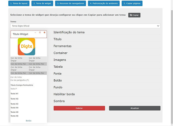
Detalhes dos campos do layout:
Identificação do tema:
-
Código: Código de identificação do tema. Não deve ser preenchido com espaços, com caracteres especiais e letras maiúsculas, digite somente letras minúsculas
-
Nome: Insira o nome do tema criado
Título:
-
Posição do título: Defina em qual posição o título ficará
-
Esquerda: O título ficará a esquerda
-
Direita: O título ficará a direita
-
Centro: O título ficará no centro
-
-
Tamanho: Defina o tamanho do título em pixels (px)
-
Cor do título: Defina a cor do título
-
RGBA: Colocar o código em RGBA
-
Hexadecimal: Colocar o código em hexa. Este código será convertido em RGBA
-
-
Cor de fundo: Defina a cor de fundo do título
-
RGBA: Colocar o código em RGBA
-
Hexadecimal: Colocar o código em hexa. Este código será convertido em RGBA
-
-
Formatação do texto: Defina a formatação de texto do título
-
Nenhuma: Não será aplicada nenhuma configuração
-
Capitalizar: A primeira letra de cada palavra será maiúscula
-
Minúsculas: Todas as letras serão maiúsculas
-
Maiúsculas: Todas as letras serão minúsculas
-
-
Fonte: Defina a fonte padrão dos widgets. OBS: Só são aceitas fonte que estão dentro do Google Fonts
-
Margem superior: Defina o tamanho da margem superior em pixels (px)
-
Margem direita: Defina o tamanho da margem direita em pixels (px)
-
Margem inferior: Defina o tamanho da margem inferior em pixels (px)
-
Margem esquerda: Defina o tamanho da margem esquerda em pixels (px)
-
Espaço interno (Superior): Defina o tamanho do espaço interno superior em pixels (px)
-
Espaço interno (Direito): Defina o tamanho do espaço interno direito em pixels (px)
-
Espaço interno (Inferior): Defina o tamanho do espaço interno inferior em pixels (px)
-
Espaço interno (Esquerdo): Defina o tamanho do espaço interno esquerdo em pixels (px)
-
Curvatura esquerda: Defina a curvatura do título da ponta esquerda superior
-
Curvatura direita: Defina a curvatura do título da ponta direita superior
-
Curvatura esquerda: Defina a curvatura do título da ponta esquerda inferior
-
Curvatura a direita: Defina a curvatura do título da ponta direita inferior
-
Habilitar borda inferior?
-
Sim : Habilita a borda inferior no título
-
Não: Desabilita a borda inferior no título
-
-
Espessura da borda: Defina a espessura da borda em pixels (px)
-
Estilo da borda:
-
Nenhum: Não aparecerá a borda inferior
-
Tracejado: A borda terá o efeito de traços separados
-
Pontilhado: A borda terá o efeito de pontos separados
-
Linha dupla: A borda terá o efeito de duas linhas continuas, uma acima da outra
-
Degradê: A borda terá o efeito de duas cores em degradê
-
Degradê inverso: A borda terá o efeito de duas cores em degradê ao inverso
-
Linha sólida: A borda terá o efeito de uma linha continua
-
-
Cor da borda inferior: Defina a cor da borda
-
RGBA: Colocar o código em RGBA
-
Hexadecimal: Colocar o código em hexa. Este código será convertido em RGBA
-
Ferramentas:
-
Habilitar:
-
Sim: Habilitar as ferramentas de engrenagem, ajuda e minimização
-
Não: Desabilita as ferramentas de engrenagem, ajuda e minimização
-
-
Cor de fundo: Defina a cor de fundo
-
RGBA: Colocar o código em RGBA
-
Hexadecimal: Colocar o código em hexa. Este código será convertido em RGBA
-
-
Cor do ícone: Defina a cor dos ícones
-
RGBA: Colocar o código em RGBA
-
Hexadecimal: Colocar o código em hexa. Este código será convertido em RGBA
-
-
Posição: Defina a posição das ferramentas
-
Esquerda: As ferramentas ficarão a direita
-
Direita: As ferramentas ficarão a esquerda
-
-
Margem à direita (px): Defina a margem, em pixels (px), que as ferramentas devem obter
-
Habilitar recursos de minimização:
-
Sim: O minimizar será apresentado na widget
-
Não: O minimizar não será apresentado na widget
-
Container:
-
Margem superior: Defina o tamanho da margem superior em pixels (px)
- Margem direita: Defina o tamanho da margem direita em pixels (px)
- Margem inferior: Defina o tamanho da margem inferior em pixels (px)
- Margem esquerda: Defina o tamanho da margem esquerda em pixels (px)
- Espaçamento interno: Defina o tamanho do espaçamento interno em pixels(px)
Imagens:
-
Curvatura: Defina a curvatura das imagens de 0 à 50
-
0 fica quadrado
-
50 fica em sua curvatura máxima, redondo
-
Tabela:
-
Cor da linha Ímpar: Defina a cor das linhas impares em uma tabela
-
RGBA: Colocar o código em RGBA
-
Hexadecimal: Colocar o código em hexa. Este código será convertido em RGBA
-
-
Cor da linha par: Defina a cor das linhas pares em uma tabela
-
RGBA: Colocar o código em RGBA
-
Hexadecimal: Colocar o código em hexa. Este código será convertido em RGBA
-
Fonte:
-
Cor de parágrafos (P): Defina a cor dos textos em parágrafos
-
RGBA: Colocar o código em RGBA
-
Hexadecimal: Colocar o código em hexa. Este código será convertido em RGBA
-
-
Cor de links: Defina a cor dos links
-
RGBA: Colocar o código em RGBA
-
Hexadecimal: Colocar o código em hexa. Este código será convertido em RGBA
-
-
Tamanho de parágrafos (P): Defina o tamanho, das letras, nos parágrafos em pixels (px)
-
Formatação do texto (P): Defina a formatação de texto em parágrafos
-
Nenhuma: Não será aplicada nenhuma configuração
-
Capitalizar: A primeira letra de cada palavra será maiúscula
-
Minúsculas: Todas as letras serão maiúsculas
-
Maiúsculas: Todas as letras serão minúsculas
-
-
Fonte de títulos (H1, H2, H3, H4, H5, H6): Defina a fonte padrão para os títulos. OBS: Só são aceitas fonte que estão dentro do Google Fonts
-
Tamanho da fonte de títulos (H1, H2, H3, H4, H5, H6): Defina o tamanho dos títulos em pixels (px)
-
Cor da fonte de título (H1, H2, H3, H4, H5, H6): Defina a cor dos títulos
-
RGBA: Colocar o código em RGBA
-
Hexadecimal: Colocar o código em hexa. Este código será convertido em RGBA
-
-
Formatação de texto de títulos (H1, H2, H3, H4, H5, H6): Defina a formatação dos títulos
-
Nenhuma: Não será aplicada nenhuma configuração
-
Capitalizar: A primeira letra de cada palavra será maiúscula
-
Minúsculas: Todas as letras serão maiúsculas
-
Maiúsculas: Todas as letras serão minúsculas
-
Botão:
Geral:
-
Cor do título: Defina a cor do título em botões
-
RGBA: Colocar o código em RGBA
-
Hexadecimal: Colocar o código em hexa. Este código será convertido em RGBA
-
-
Formatação do texto: Defina a formatação do texto
-
Nenhuma: Não será aplicada nenhuma configuração
-
Capitalizar: A primeira letra de cada palavra será maiúscula
-
Minúsculas: Todas as letras serão maiúsculas
-
Maiúsculas: Todas as letras serão minúsculas
-
-
Cor de fundo: Defina a cor de fundo
-
RGBA: Colocar o código em RGBA
-
Hexadecimal: Colocar o código em hexa. Este código será convertido em RGBA
-
-
Habilitar borda:
-
Sim: Habilita borda no botão
-
Não: Desabilita borda no botão
-
-
Espessura da borda: Defina a espessura da borda em pixels (px)
-
Estilo da borda:
-
Nenhum: Não aparecerá a borda
-
Tracejado: A borda terá o efeito de traços separados
-
Pontilhado: A borda terá o efeito de pontos separados
-
Linha dupla: A borda terá o efeito de duas linhas continuas, uma acima da outra
-
Degradê: A borda terá o efeito de duas cores em degradê
-
Degradê inverso: A borda terá o efeito de duas cores em degradê ao inverso
-
Linha sólida: A borda terá o efeito de uma linha continua
-
-
Cor da borda: Defina a cor da borda
-
RGBA: Colocar o código em RGBA
-
Hexadecimal: Colocar o código em hexa. Este código será convertido em RGBA
-
-
Curvatura do botão: Defina a curvatura das imagens de 0 à 50
-
0 fica quadrado
-
50 fica em sua curvatura máxima, redondo
-
Botão de navegação:
-
Cor: Defina a cor do botão
-
RGBA: Colocar o código em RGBA
-
Hexadecimal: Colocar o código em hexa. Este código será convertido em RGBA
-
Botão ver mais:
-
Cor do título: Defina a cor do título
-
RGBA: Colocar o código em RGBA
-
Hexadecimal: Colocar o código em hexa. Este código será convertido em RGBA
-
-
Cor do ícone: Defina a cor do ícone
-
RGBA: Colocar o código em RGBA
-
Hexadecimal: Colocar o código em hexa. Este código será convertido em RGBA
-
Fundo:
-
Cor: Defina a cor de fundo da widget
-
RGBA: Colocar o código em RGBA
-
Hexadecimal: Colocar o código em hexa. Este código será convertido em RGBA
-
-
Repetir imagem: Defina se a imagem de fundo irá se repetir no menu
-
Sem repetição: A imagem não irá se repetir
-
A direita da Widget : As imagens se repetirão somente a direita das widgets do topo
-
A baixo da Widget: As imagens se repetirão somente a baixo das widgets do topo
-
Repetir ambos: A imagem irá se repetir em ambas as direções
-
-
Acompanhar rolagem:
-
Acompanhar rolagem:
-
Fixo:
-
-
Comportamento da imagem de fundo da widget:
-
Original: A imagem ficará no tamanho original
-
Adequar: A imagem irá se adequar ao tamanho da tela
-
Expandir: A imagem irá se expandir para cobrir todos os espaços da tela
-
-
Imagem: Caso opte por colocar uma imagem de fundo no menu, primeiro insira a imagem no seu ECM e depois clique no campo busca para selecionar a imagem desejada. OBS. Se colocar uma imagem ela irá sobrepor a cor de fundo
-
Posição da imagem: Defina a posição que a imagem ficará
-
Superior: O foco será na parte superior da imagem
-
Direita: O foco será na parte direita da imagem
-
Inferior: O foco será na parte inferior da imagem
-
Esquerda: O foco será na parte esquerda da imagem
-
Centralizado: O foco será no centro da imagem
-
Habilitar borda:
Superior e Inferior:
-
Espessura (px): Defina a espessura da borda em pixels (px)
-
Estilo da borda:
-
Nenhum: Não aparecerá a borda
-
Tracejado: A borda terá o efeito de traços separados
-
Pontilhado: A borda terá o efeito de pontos separados
-
Linha dupla: A borda terá o efeito de duas linhas continuas, uma acima da outra
-
Degradê: A borda terá o efeito de duas cores em degradê
-
Degradê inverso: A borda terá o efeito de duas cores em degradê ao inverso
-
Linha sólida: A borda terá o efeito de uma linha continua
-
-
Cor: Defina a cor da borda
-
RGBA: Colocar o código em RGBA
-
Hexadecimal: Colocar o código em hexa. Este código será convertido em RGBA
-
-
Curvatura esquerda: Defina a curvatura da borda em pixels (px)
-
Curvatura direita: Defina a curvatura da borda em pixels (px)
Direita e Esquerda:
-
Espessura (px): Defina a espessura da borda em pixels (px)
-
Estilo da borda:
-
Nenhum: Não aparecerá a borda
-
Tracejado: A borda terá o efeito de traços separados
-
Pontilhado: A borda terá o efeito de pontos separados
-
Linha dupla: A borda terá o efeito de duas linhas continuas, uma acima da outra
-
Degradê: A borda terá o efeito de duas cores em degradê
-
Degradê inverso: A borda terá o efeito de duas cores em degradê ao inverso
-
Linha sólida: A borda terá o efeito de uma linha continua
-
-
Cor: Defina a cor da borda
-
RGBA: Colocar o código em RGBA
-
Hexadecimal: Colocar o código em hexa. Este código será convertido em RGBA
-
Sombra:
-
À direita da widget: Defina o quanto a direita ficará a sombra, o tamanho é contado em pixels
-
Abaixo da widget: Defina o quanto abaixo ficará a sombra, o tamanho é contado em pixels
-
Efeito de desfoque: Defina a quantidade de desfoque em pixels
-
Tamanho de avanço da sombra: Defina o tamanho que a sombra deve avançar
-
Cor: Defina a cor da sombra
-
RGBA: Colocar o código em RGBA
-
Hexadecimal: Colocar o código em hexa. Este código será convertido em RGBA
-
Ao finalizar todas as modificações, clique em "Atualizar"
Recursos de navegadores
Na aba de "Recurso de navegadores" você poderá mexer com logos, favicon e plano de fundo.

Logo
O logo é a imagem utilizada na tela de login e no topo da página
-
Escolher arquivo: Permite escolher um arquivo direto do seu computador
-
Altura recomendada: 60 pixels (px)
-
Largura recomendada: Não possui limite
-
Formata: A imagem deve ser obrigatoriamente .png
Favicon
O é a imagem apresentada na aba dos browsers (navegadores) ou na tela de favoritos do browser
-
Escolher arquivo: Permite escolher um arquivo direto do seu computador
-
Altura recomendada: 32 pixels (px)
-
Largura recomendada: 32 pixels (px)
-
Formata: A imagem deve ser obrigatoriamente .ico
Plano de fundo
-
Escolher arquivo: Permite escolher um arquivo direto do seu computador
-
Altura recomendada: 1024 pixels (px)
-
Largura recomendada: 768 pixels (px)
-
Formata: A imagem deve ser obrigatoriamente .png
-
"X": Permite remover a imagem de fundo
Padronização do ambiente
Na opção "Padronização do ambiente" você poderá aplicar o tema de layout construído nas etapas anteriores em todas as páginas do TOTVS Fluig Plataforma

Tema
Selecione o tema que deseja aplicar em todas as páginas
Botão Aplicar
Ao apertar "Aplicar" o tema será aplicado em todas as páginas da plataforma. OBS: Este processo pode levar alguns minutos, pois aplica o tema de layout em todas as páginas do TOTVS Fluig Plataforma
Botão Redefinir
Retira o tema de layout da Digte e retorna pra o tema padrão do TOTVS Fluig Plataforma
Configurando comunidades
São páginas que possuem todo tratamento de colaboração.
Ao criar uma comunidade, automaticamente, ela será criada com o tema clássico do TOTVS Fluig Plataforma, e para permitir a utilização dos widgets do Digital Workplace by Digte é necessário trocar o layout para o da Digte.
Lembrando que o layout da Digte tem as bordas coloridas, como a imagem abaixo:

Siga o caminho a baixo para trocar o layout de uma comunidade:
"Sua comunidade" > Foto de perfil > Editar página > Foto de perfil > Trocar Layout

Ao escolher a opção de "Trocar layout", basta clicar no layout desejado e clicar em "Aplicar"
Através do wizard de configuração é possível migrar todas as páginas do TOTVS Fluig Plataforma (customizadas e padrões) para um tema de layout do Digital Workplace by Digte.
Durante o processo de instalação do Digital Workplace by Digte, é criada uma pasta chamada “Comunidades”, a qual recomendamos sua utilização para centralizar os conteúdos (documentos, formulários, artigos, vídeos, imagens) de suas comunidades. OBS: Importante ressaltar que cada comunidade deve ter sua própria estrutura de pastas.
Configurando menu
O menu do TOTVS Fluig Plataforma com o Digital Workplace by Digte passa a ter novos recursos como:
1) Troca de ícones;
2) Troca de ordem das páginas;
3) Inclusão de novos ícones, que não fazem parte do arsenal do TOTVS Fluig Plataforma
4) Links com direcionamento para páginas externas, fora da plataforma
Esta personalização ocorre via formulário de configuração, localizado em: Intranet by Digte > Cadastros > Customizações do Menu

Escolha a página que deseja configurar e clique em "Editar".

-
Menu adicional?
-
Sim: Indica que não está ligado a uma página existente no TOTVS Fluig Plataforma e permitirá o acesso a uma URL diretamente
-
Não: Indica que irá substituir as configurações de uma página existente no TOTVS Fluig Plataforma
-
-
Código da página: Insira o código gerado no momento de criação da página. Este código, normalmente, está inserido na URL da página, por exemplo "https://portal.digte.com.br/portal/p/digte/digte-academy", o código da página é "digte-academy"
-
Abrir um uma nova aba?
-
Sim: Ao clicar na página ela será aberta em uma nova aba
-
Não: Ao clicar na página ela será aberta na mesma aba
-
-
Título (Português, Inglês, Espanhol): Configure o título da página que será apresentado no menu. Você configurar para Português, Inglês e Espanhol.
-
Sequência: Defina em qual sequência a página será apresentada no menu
-
Ícone: Escolha um ícone para ser apresentado junto com o título no menu. OBS: Esses ícones são somente do arsenal do TOTVS Fluig Plataforma
-
Link: Insira um link caso deseje que o direcionamento seja para uma página externa do portal
-
Url da imagem: Ao inserir uma imagem em seu ECM você consegue gerar um link, através deste você adicionar seu próprio ícone
-
Imagem dos documentos: Insira a imagem no seu ECM, depois clique na lupa e procure o ícone que deseja apresentar no menu
-
Largura e altura: Defina a largura e altura, que seus ícones terão, em pixels (px)
Ao finalizar clique em "Salvar".
Formulários de páginas, widgets e layout
O Digital Workplace by Digte, por padrão, faz a atualização dos formulários de Páginas, Widgets e Layouts, por esse motivo recomendamos que não alterem manualmente o formulário. Caso isso aconteça, há o risco do seu ambiente obtenha alguns problemas de funcionamento.
As seguintes pastas armazenam os formulários que NÃO devem ser editados manualmente.
A partir da atualização de 21/01/2020, na nova versão do Empower do Digital Workplace by Digte, foi disponibiizado uma central de cadastros. O que antes era necessário ir ao ECM para ser feito, agora serão utilizados na nova central. Há dois meios para acessar essa nova central:
1) Clicando na engrenagem da widget:
Ao clicar na enggrenagem da widget, o usuário é direcionado para a página de "Cadastros" e o formulário correspondente da widget pré-selecionada.
2) Clicando na página "Cadastros" no menu:
Ao seguir o caminho: Intranet by Digte > Cadastros você conseguirá acessar a todos os formulários de todas as widgets
Assista o vídeo para maiores esclarecimentos: